

Design Fails That Make No Sense
Nobody's perfect. We all make mistakes. And design is full of tiny pitfalls that are easy to miss. Thankfully, designers usually learn from their early failures and ultimately become better for it. In that sense, design fails aren't all that bad—for the most part.
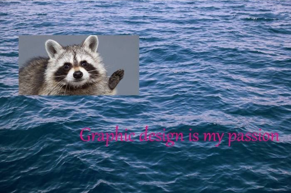
But every now and then, you get something like this poor racoon stranded at sea …
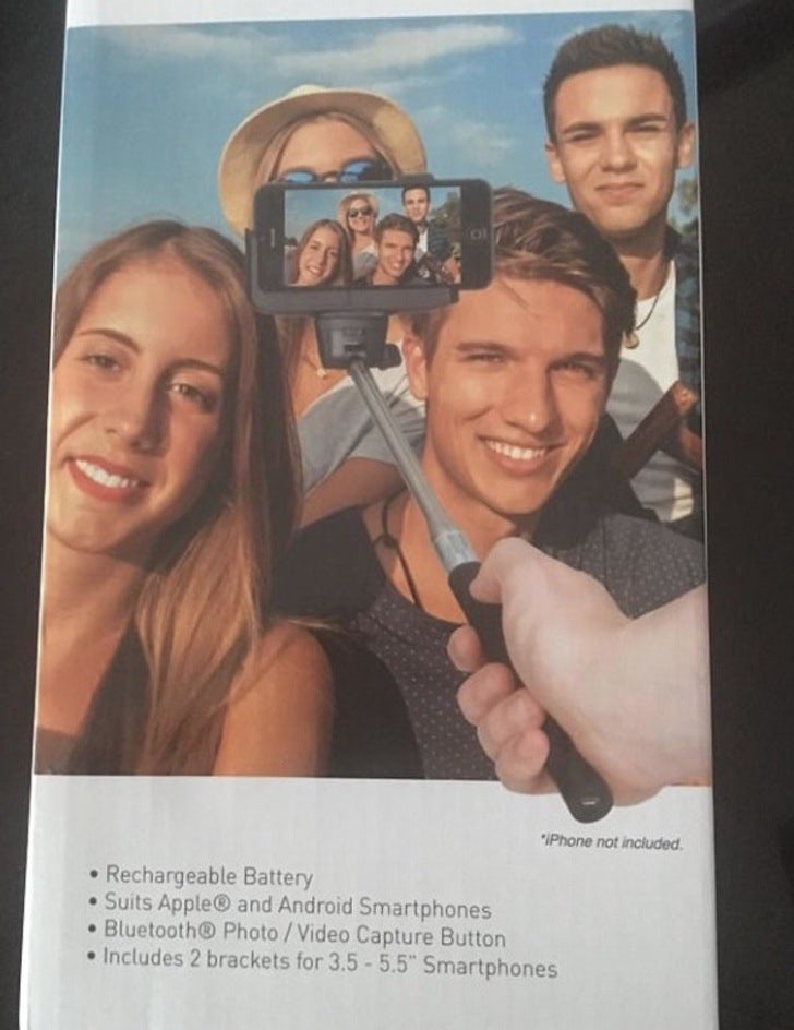
…or this…
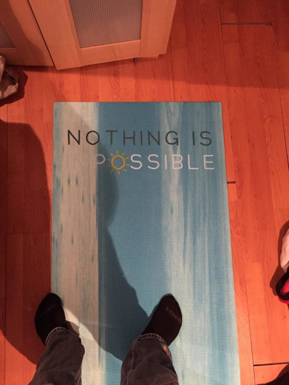
…or this…
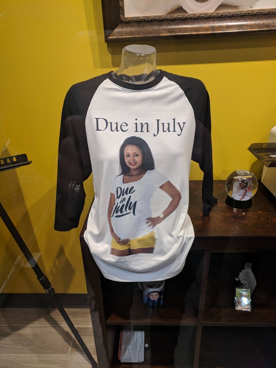
… or even this.
Below, we look at eight laughable design fails and the valuable lessons those designers could have learned to keep their jobs.
1. Location, location, location
—
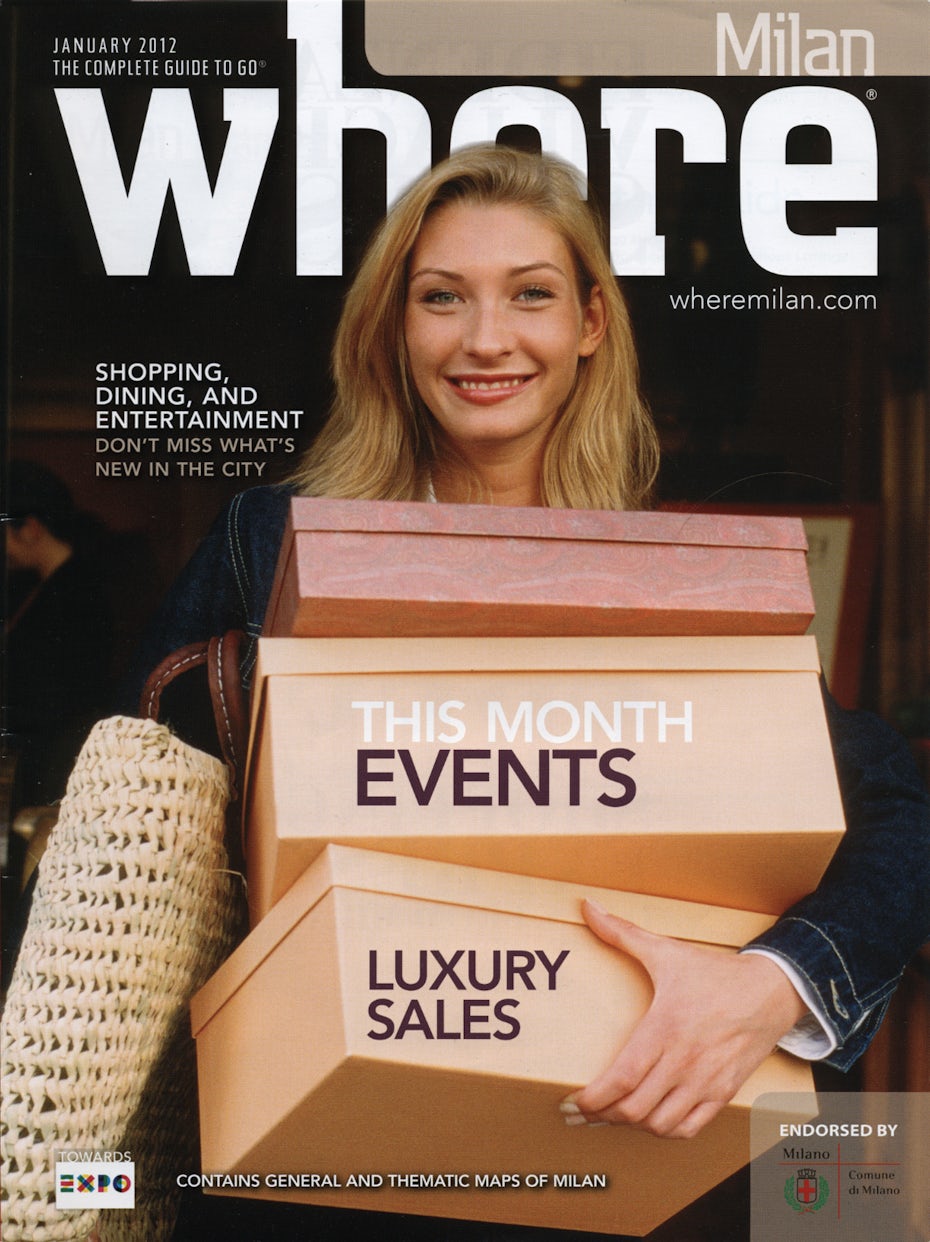
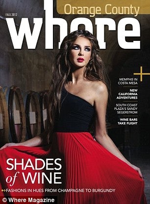
This copy of Where magazine—that's "Where" with two Es—shows us just how important layout and composition are in graphic design. The photographer did his or her job, but what about the cover designer? That poor woman looks so happy after a fruitful shopping trip, it's a shame she has to be slandered by a design fail.
For starters, this problem could have been avoided by positioning the photo lower so that the E doesn't look like an O. That seems like an easy cropping choice to make and it's not like the reader would miss seeing the bottom of the third box. On top of that, the title could be superimposed over the model's head, as long as it didn't cover too much of her face.
As if this weren't bad enough, the magazine made the same exact mistake a few months later! Perhaps they should consider a name change.
2. The importance of kerning
—
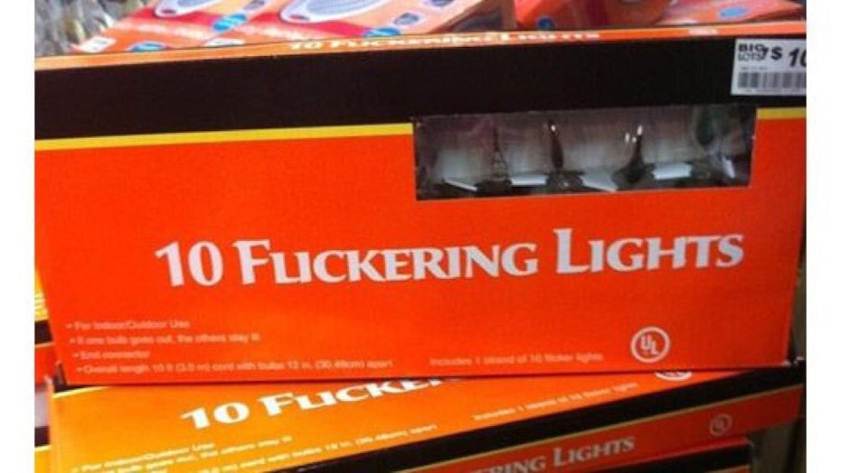
Do you know what "kerning" is? Neither did the package designers behind this box of holiday lights.
Kerning is the design term for using the spacing between letters to make text more readable. The application of kerning can get pretty technical, with precise measurements, variations for different letters and sometimes even exact pixel guidelines. That's why it's a field that designers need to understand to avoid these kinds of mistakes.
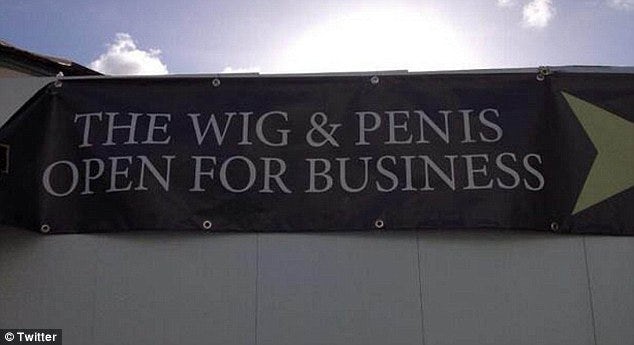
However, most non-designers don't even know such a field exists. And that's why they run into problems like those faced by England's famed Wig & Pen.
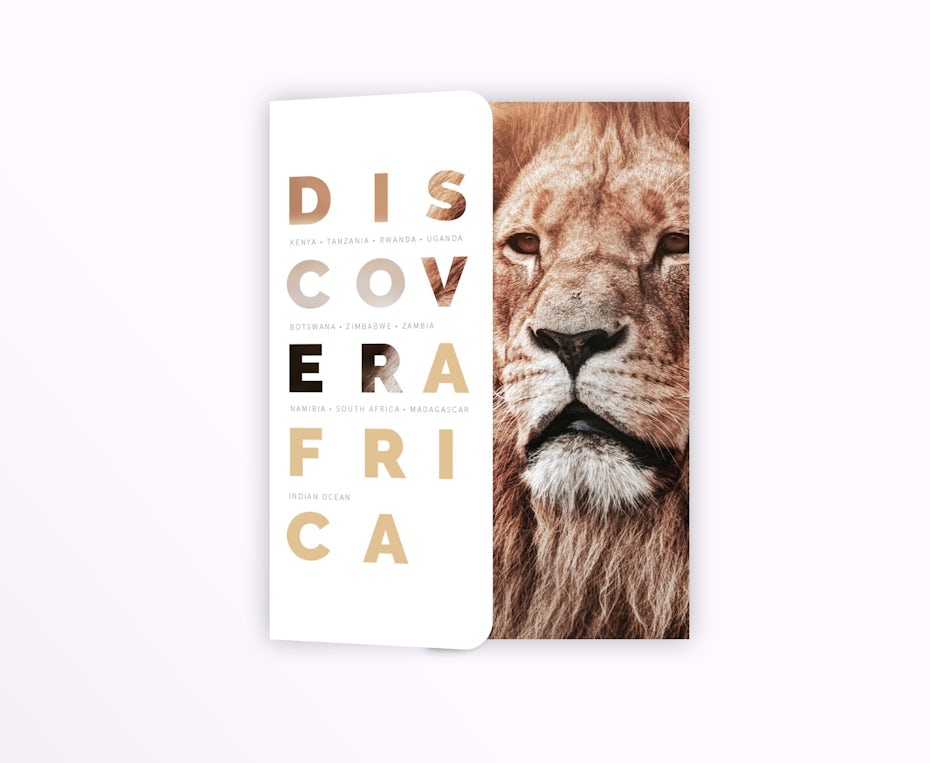
3. Brea king words
—

App rentals? Ice ships? Rent ice?
Breaking up words that shouldn't be broken up is a classic design fail, but breaking up one big word four times into pieces that are incidentally their own words, that's epic. What makes this ad even worse (and kind of sad) is not only that they're trying to entice people to work with them, but they're also a company that specializes in graphic design.
Yet we don't want to dissuade designers against the technique entirely—when done well, it's actually quite effective:
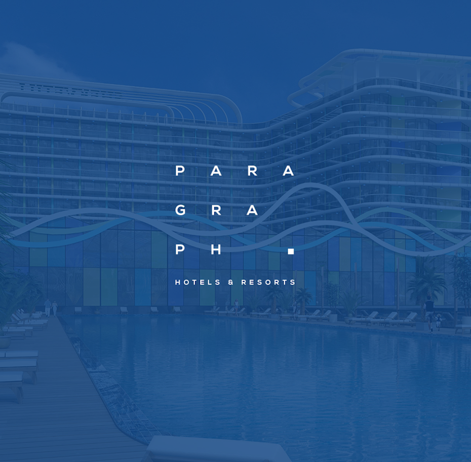
But when using it, exercise caution. Whenever possible avoid creating real words with kerning and keep your message simple. The shorter the sentiment, the easier it will be for the viewer to piece it together—literally.
4. The "art" of communication
—

A large part of graphic design is about communicating visually: it's the designer's job to make a message easy to understand. But that goes both ways and poor design choices can complicate an otherwise straightforward message.
You buy 3 and get 2 free or you buy 2 and get 1 free. It shouldn't take the reader five or six read throughs to arrive at this conclusion. But the poor layout of the message—not to mention the confusing asterisks—makes this ad repel customers rather than draw them into the store.
For one thing, the setup looks like an equation, and no one wants to do math when they don't have to. But shrinking down the second part makes it seem like it's a clarification of the first message, not a separate sales concept. While this is an honest mistake, these little nuances are something experienced designers instinctively know to sidestep.
5. Say what you mean
—
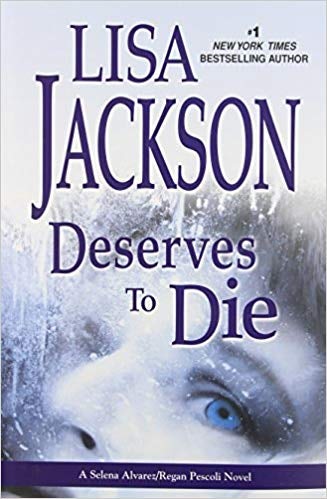
I mean, this may not be her best work, but wishing death upon her is a bit much.
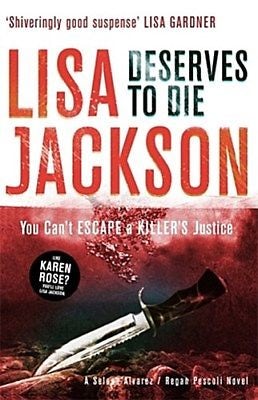
Designers aren't only in charge of how things look, they also need to watch out for contextual mistakes. When it comes to book cover design, that means combining the title and author name in a way that doesn't have an unintended meaning. The way this book cover is set up, with the title and author name in the same color and font—and the name above the title—was an easily avoidable mistake.
In this case, the publishers eventually caught on and fixed the design fail in the subsequent editions using different colors and typefaces.
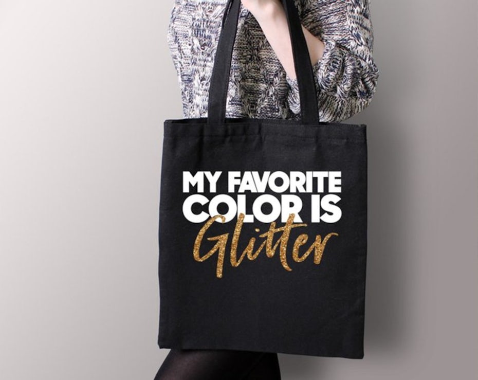
6. Cursive: the designer's natural predator
—
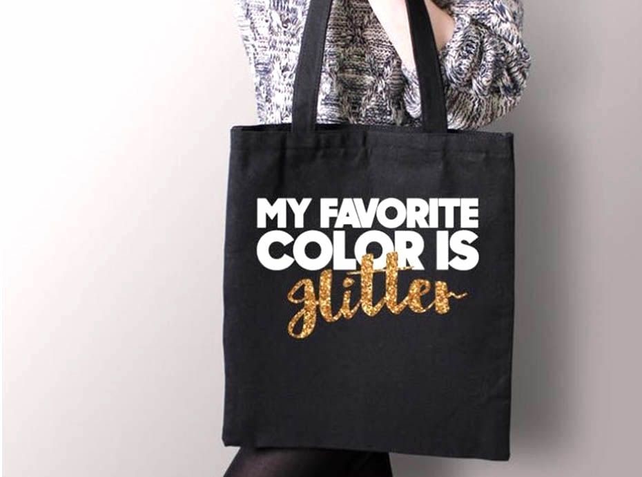
The ambiguity behind cursive writing has long been the nemesis of well-meaning designers, but few have suffered from its evil snares quite like designer Belle Chic, whose girly-cute handbag accidentally transformed into a piece of neo-nazi propaganda.
Given that (1.) the cursive G is a bit too high, plus (2.) a bit too close to the L, and that (3.) the cross of the second T is overshadowed by the bold white letters above, "glitter" is not the obvious interpretation of this sparkling lettering. It's surprising that no one noticed this mistake until after its release; any one of those typographical errors would have signaled red flags to a seasoned designer.
Luckily, Belle Chic apologized profusely for their design fail and corrected all three typography errors without throwing out the design.
7. Catch secondary meanings
—
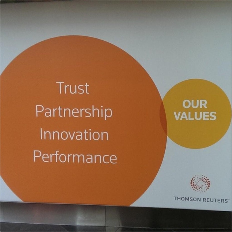
Graphic designers need to be part proofreader. They have to double-check to ensure their designs don't have any problematic secondary meanings.
That was the case with mass media conglomerate Thomson Reuters. Inadvertently, their design looks like a Venn diagram showing just how little they value trust, partnership, innovation and performance.
In all likelihood, the design was never meant to look like a Venn diagram—rather, just a playful graphic using shapes and colors. However, one tiny move and now a huge, expensive advertising campaign leaves them with egg on their face. Better to go with a designer that can catch these mistakes in the early design stages.
8. Even when you're right, you're wrong
—
This one's pretty tricky. When the Ready Player One poster first came out, it was criticized for the character's freakishly long leg. And rightfully so—just look at it.
At first people thought the image was doctored, but it turns out that it's actually accurate! Twitter fan Captain Disillusion dissected the image and proved that the leg is completely proportional to the rest of his body; it just looks long because of the awkward angle and the pose. The image is perfectly normal—it's the human eye that's weird.
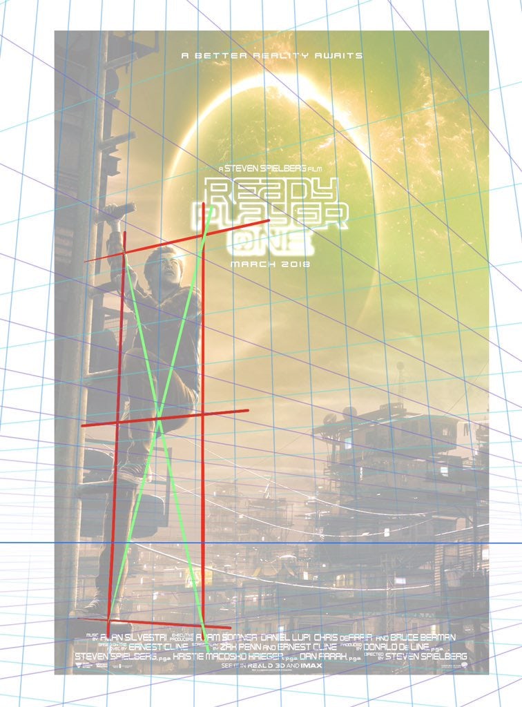
Which brings up a good point about graphic design: a designer's job is to make sure everything looks fine more than actually being fine. In a field based on perception, how people perceive the work is more important than factual accuracy, which comes into conflict more than you'd think with the visual arts.
The difference between applause and faux pas
—
Not to use scare tactics, but one silly design fail could ruin your entire brand reputation. And we'd wager all of the design mistakes above were made by folks who overestimated their design skills. That's why these things are best left to the professionals.
True design talent lies in understanding the risks well enough to tiptoe around them. The skillset of a good designer includes all the basics like kerning, color theory, typography dos and don'ts, an encyclopedic knowledge of fonts and an eye for avoiding common pitfalls. Now that you've seen some epic design fails, you'll know what to look out for—and hiring a great designer is your ticket to ensuring everyone talks about your next campaign for the right reasons.
There's a surefire way to never be mentioned in a list of design fails...
Find yourself a great designer!
Design Fails That Make No Sense
Source: https://99designs.com/blog/tips/graphic-design-fails/
Posted by: hillsuation.blogspot.com
0 Response to "Design Fails That Make No Sense"
Post a Comment